Marketing Materials Reflection:
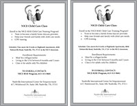
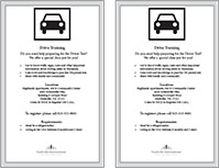
The marketing materials assignment gave me a better idea of the full scope of what goes into marketing. At first, the assignment seemed like an easy A, but after seeing how complex InDesign was, as well as the many aspects that go into marketing, I realized that my initial impression was far off. Ashli and I were delegated the task of redesigning NICE’s Child Care flier and Driving Classes flier, which required an especially firm understanding of our audience. Since our media were intended to be consumed by refugees, making fliers that were simple, easy to understand, and incorporated explanatory images was key. Many refugees have limited English speaking abilities, so pictures of cars, roads, children, and families really helped to emphasize the purpose of our fliers. In order to further simplify our materials, we made addresses and deadlines larger than the rest of the text and bold, so as to aid refugees in viewing some of the important dates and places. In terms of our text, we were sure to maintain the minimal, yet necessary, information that was written on the original fliers. By keeping sentences small and unchallenging, even refugees with very sparse understandings of English could most likely infer the meaning.
The design of our flier was, as I explained earlier, straightforward, however, it also had to be cost effective. Since NICE operates under a tight budget, colored fliers were out of the question. Serving as quite the challenge, Ashli and I had to figure out how to create a flier that was extremely gripping, yet black and white. We decided on light gray borders for both fliers, since they would print well while still providing a bit of a contrast from the plain white paper. We chose clipart style images in black and white, as well, that would print easily and still convey the purpose. We centered the text in order to make the page look proportionate and included lots of space between each text box. We knew that a cramped-looking flier would not only be unappealing to the eye, but would also make it difficult for many refugees to understand. Our text was organized using bullet points to explain each class, and we kept them short, sweet, and to the point. Our writing choices reflected the need to maintain clarity among our audience, while simultaneously supplying the information needed to enroll and attend the classes presented in our fliers.
The service I have done with NICE allowed me to put a face to the refugees being targeted in our fliers. It’s strange when you’re used to seeing the publicized, media-version refugees portrayed on the news, and then suddenly you’re at an airport terminal, waiting for refugees that are about to begin their lives in the United States. My work with NICE helped me to conceptualize my audience much easier and hopefully create a piece of marketing material that they can suitably relate to and fully understand.