Jacquelyn Green
For my marketing materials revision, I set out to reassess and NICE’s info sheet, a document that provides a large-scale picture of the company for potential partners. This document serves as a brief glimpse into the organization’s purpose, history, and growth through informative content and client spotlights, as well as a snapshot of the company’s recent accomplishments.
My first goal was to create a workable, modern branding template for NICE to follow. Currently, their info sheet used elements that I considered to be outdated and stale. I wanted to freshen up their overall image by implementing simplistic, modern styles, but I did keep some elements from the original document. For example, I kept NICE’s color scheme as seen in their logo (orange, two shades of green, and red) as a basis for the theme in my document. In choosing shapes, I went for a similar but more simplistic look using straight lines under headings but circles for image shapes. On NICE’s website, they incorporate a lot of circles, so I felt this was an easy way to stay on-brand. Moreover, this choice is sustainable, since anyone can easily go into InDesign and update these images when necessary. Another intentional change I made was in font choices. Rather than the more formal serif type font, I went with what I thought was a cleaner, more accessible sans serif font; for body, I used Avenir Book, and for headings, Avenir Black, which I thought would be a good choice for an expressive yet modern font.
In revising the content for these two pages, I had the mindset of improvement.
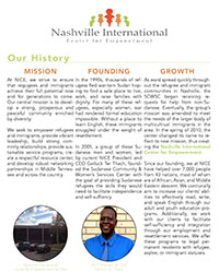 Nobody knows NICE better than the NICE staff, volunteers, and clients, so I did not think it was my place to overhaul their information. I wanted to analyze their story and see how I can add value to it. I utilized editing methods learned in class to revise and improve the content on the first page, keeping the original subheadings. Aside from some edits to make the text more vibrant and present, the most noticeable change I made was to develop a consistent point-of-view. I see this info sheet as a conversation between NICE and their potential donors or partners, so I wanted the document to use first-person language from the organization’s perspective. I had some minor difficulties with this, particularly in telling the history of NICE and the organization’s transition from the Sudanese Community & Women’s Center to its current title. Overall, though, I do think I was successful in revising the content to better facilitate the organization’s message.
The ‘client stories’ section was the most challenging and exciting aspect of the document. I felt strongly about reorganizing the content to make the stories of these refugees as accessible and engaging as possible. To make this most effective, I wanted to cut a lot of the text. This may seem counterintuitive,
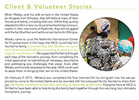 but I felt that taking away unnecessary body, we could better capture the reader’s eye and draw them into the content, all of which is (hopefully) straightforward without sacrificing the sentiment of the story. I also wanted to incorporate personal images here. This was somewhat unsuccessful, just because of the time constraints of the project and not being able to actually receive updated feature stories from another group. Nonetheless, I hope that my design displays the intent, which is to quickly grab the reader’s attention so that he can care about NICE’s clients on a personal level.