
Once we learned of our project topics and decided on our name “Slow Your Style: No More Fast Fashion,” our group wanted to figure out what our color palette would be for our site so that we could come up with logos and site designs that utilized the same colors. We used a website called Coolors which is a color palette generator that allows you to browse palettes that others have made and generate them yourselves. After browsing around these palettes and making out own, we decided on a green and neutral color palette, both because we liked how the colors looked together, but also because it evoked nature and the environment.
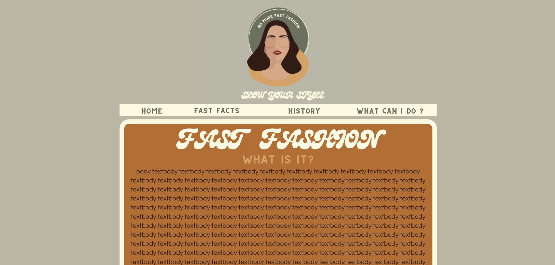
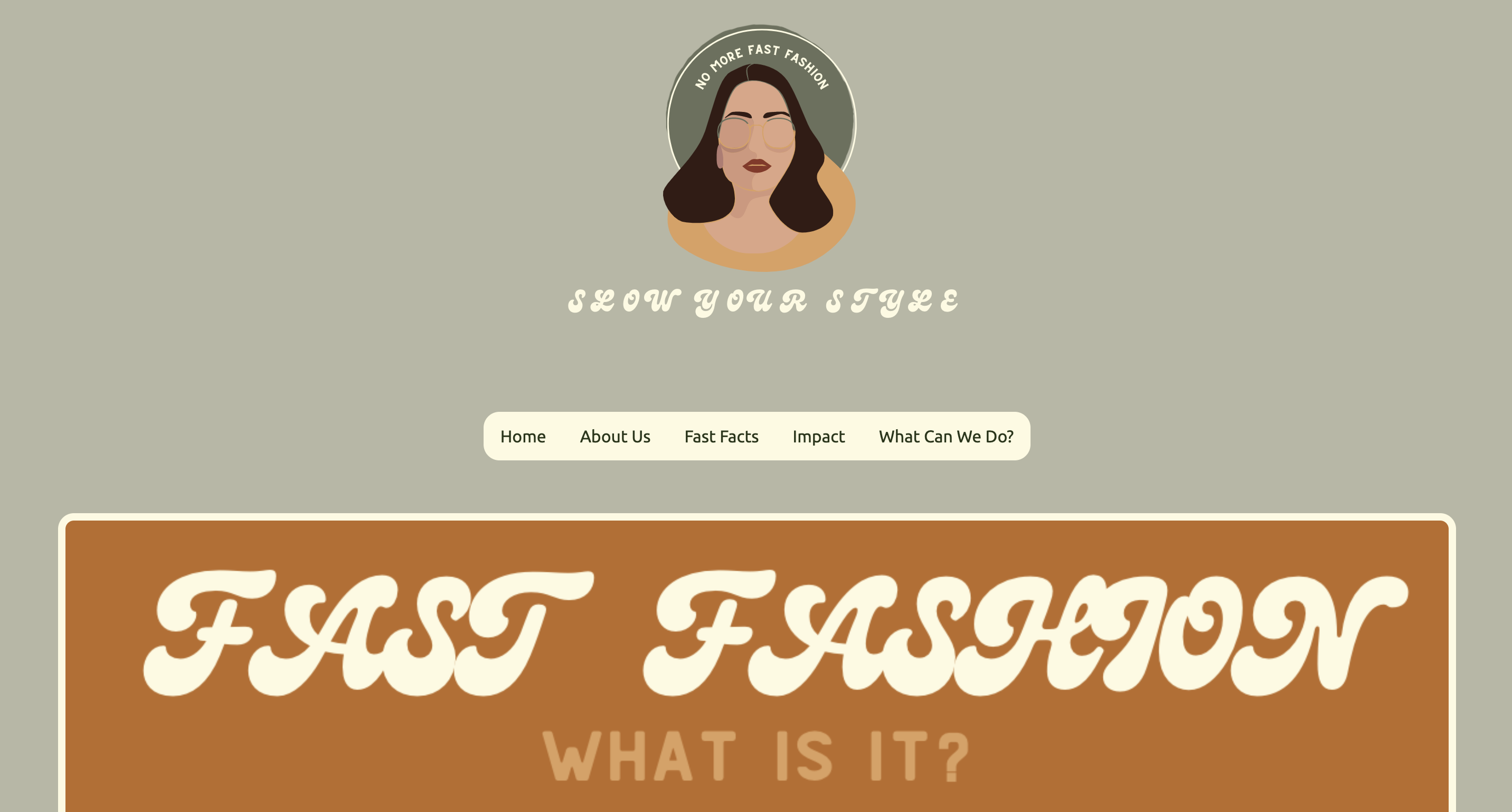
After this we split up and I got to work trying to figure out what our logo should look like. I began by Googling some different logos for inspiration, trying to figure out what sort of logo would serve us best in disseminating our ideas. I then went on Canva to look at some of the templates they had there to gain more inspiration. I found a fun, groovy font that I liked, and one that looked good in our color palette. I made a very simple logo, one that was just the letters of out title arranged on a wobbly circle that had “NO MORE FAST FASHION” curved around the bottom. I liked this logo a lot, but it didn’t feel like it would look the best as the header of a website, so I kept looking. Under the “Fashion Logo” section of the site I found a pretty outline of a woman wearing glasses that was color customizable. I didn’t think there was enough to the logo, so I took the wobbly circle from my original logo and placed it behind the woman’s head and found a circle outline that was also a little wobbly, which I made a light color and haloed it around the circle. Finally, I curved “NO MORE FAST FASHION” around the top and added the title to the bottom, in the same groovy font from my original logo.
I used this logo as my inspiration for the rest of my site design. The fonts used in the logo were the ones that I used in my site proposal as my heading fonts. I took the rounded theme and applied it throughout, curving the edges of my borders. I made a second page to show what a different content page might look like for our site, one about fast facts, keeping with the style of the previous page. After meeting with my group, we decided that we would go with my site design, as it combined many of the elements that my other group members incorporated into their designs.
Next came the decision of how we would divide up the project. We each detailed our skills, who was best at coding vs. video editing and so on and decided that Natalie and I would work on coding the webpages, Ellie and Anna would work on the video, and we would all contribute to the research element. We made a Google Drive where we would store all of our information, and we got to work. I began by mimicking the site design I made in Canva as best I could, although some fonts were specific to the site, so I made certain titles into images so that I could keep them. Natalie and I spent one whole class making a hover-sensitive dropdown navigation bar. I rounded the edges of the navbar to match the rest of our site later on in the process.
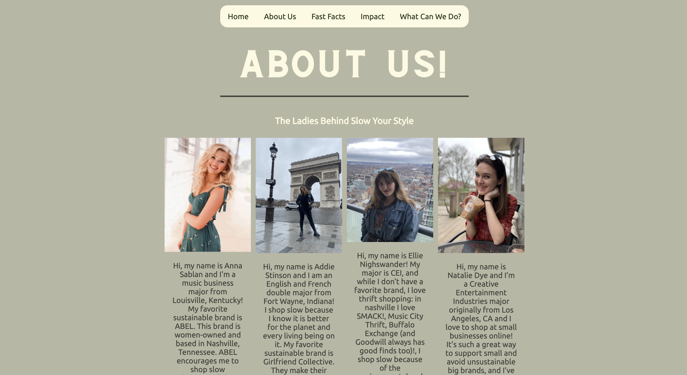
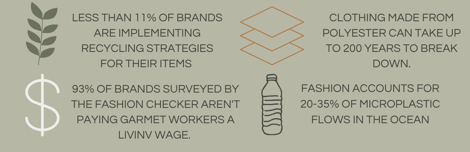
After I finished the homepage of our website, I moved onto the about page. I made a gallery based on the tutorial in W3 Schools. I had everyone in my group send me a photo of them and a short bio to put under the photos as a caption. For my final page I designed the fun facts page. This page was relatively easy, as it was comprised of mostly images.
Our next step was to get feedback on our rough drafts. Our website was pretty complete at that point, so most of our feedback had to do with small finishing details, like making our fonts coherent and fixing a couple of broken links. Natalie had the smart idea to use the other logo that I had designed for the icon on the tab at the top of the screen. I found a Google font that I really liked that I felt fit with the rest of our fonts, so I embedded it into all of our HTML files. After we cleaned up the site, Natalie sent me her docs over our Google Drive, and I gathered all of our files together and made sure it looked and functioned perfectly.
I paid very close attention to the design principles that we have discussed this semester when I was comprising my parts of the site. When picking a color palette, I made sure to have a variety of light colors and dark, so that we could contrast them against each other and make the site easier to read and understand. I not only tried to contrast light and dark on my pages, but I also contrasted colors, using a darker burnt orange, against a lighter sage green and a pale cream in contrast to a darker forest green. In addition to my use of contrast, I used repetition as well. I repeated the same fonts, colors, curved edges, and style of icons throughout so that the site looked cohesive. I took painstaking effort to make sure that each of my elements was perfectly aligned in the center using the < main class= “flex-center”> tag, so that the website felt and looked professional. I wanted to make sure that I controlled the padding carefully on my pages so that all of our elements are properly spaced and that things that are related to each other are close enough together to appear so. This project gave me a lot of confidence in not only my skills in coding, but also my skills in design and making something that looks professional and beautiful.