A Look at DON: A Nashville Organization
My group, which consisted of students who are avid dog lovers, decided to create a site that introduces opportunities for dog adoption in the Nashville area. We decided that our website would have a positive tone and reach to all ages, providing information about local shelters and popular resources, as well as linking to other, external sources that could potentially benefit a visitor to our site. My personal contribution to the group was in leading the construction of our website design and HTML build. Because I've accrued a safe level of confidence in HTML over the course of this semester, I wanted the opportunity to create a semi-professional site design that would push my skillset in HTML and CSS. Though I had the opportunity to collaborate with my group about certain design choices, the visual construction of the website, and indeed, the coding of the website itself, was the task that I happily undertook for this project.
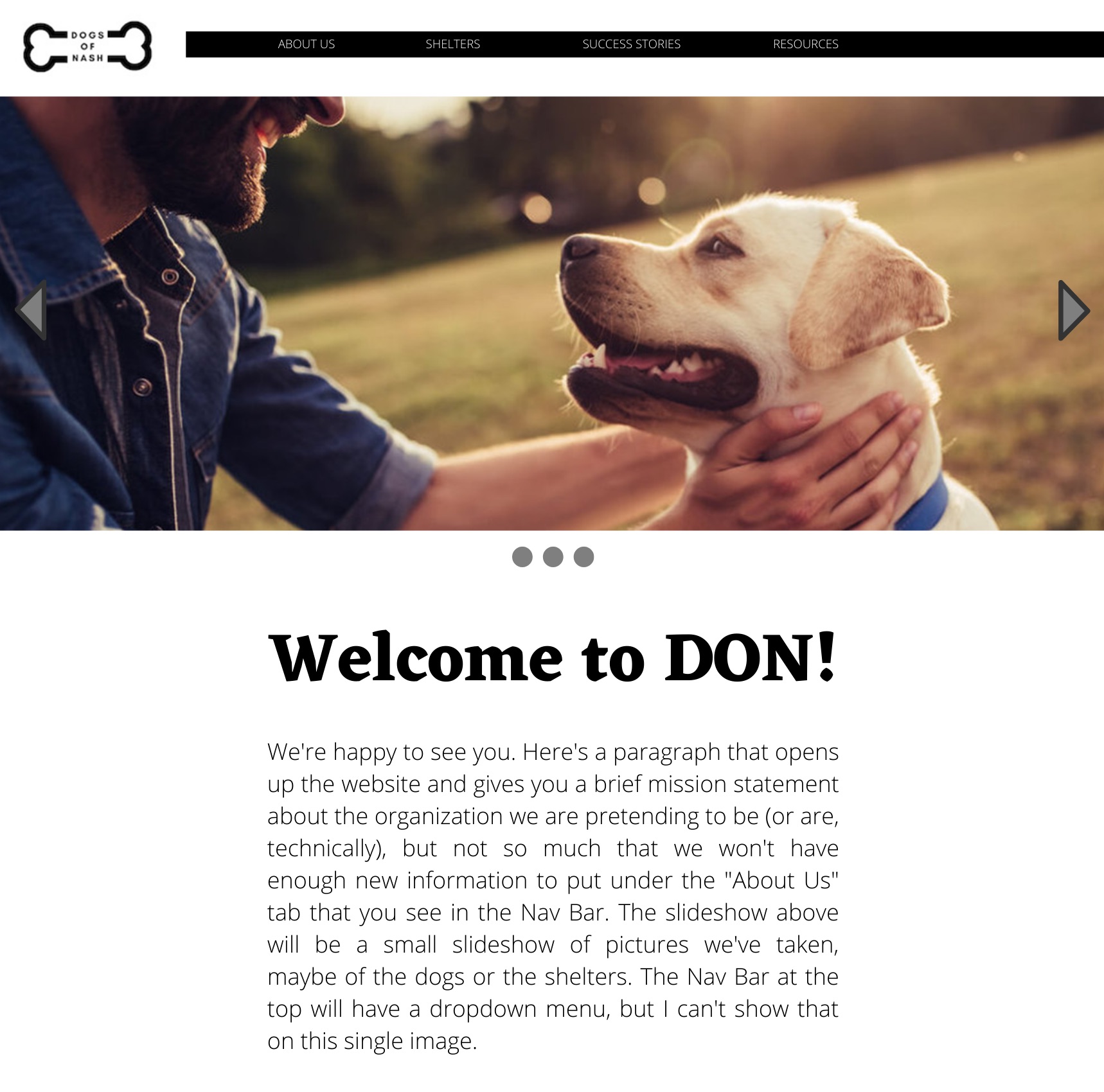
The development of our website began with a website mockup and a choice of logo. Though I created my own logo, as did all group members, we unanimously decided to use Sara's logo for the final version of the site. However, we decided to use the website mockup that I had made with Canva and Photoshop. I had pictured something simple and nearly minimalistic, but not in a way that seemed too simple to look professional. Sara had come up with a color and a black and white version of her logo, so when we put the two together for the final HTML site, we decided that the black and white version fit very well. When I actually began crafting the HTML and CSS for the site, I brought a lot of former knowledge to the project from my previous work on my own personal site that I designed at the beginning of the semester. Changing the fonts, embedding a link within an image, and creating rows and columns on a page paid off when I began the process for the DON site. However, I was very specific with my vision for alignment on certain pages, such as the "Shelters" page. It took time to figure out how to center something that doesn't exactly split the screen 50/50, or how to get images and text to align in the same row in a certain way. I also dedicated a certain work day to figuring out how to get our slideshow on the home page to work the way that I had imagined. The development process only became difficult when I came across a part of website design that I hadn't already practiced, but wouldn't give up on. I certainly had a specific image in my head of how I wanted the site to look, but after two weeks of working on the details, I was incredibly happy with the way the finished draft looked so much like my original mockup.
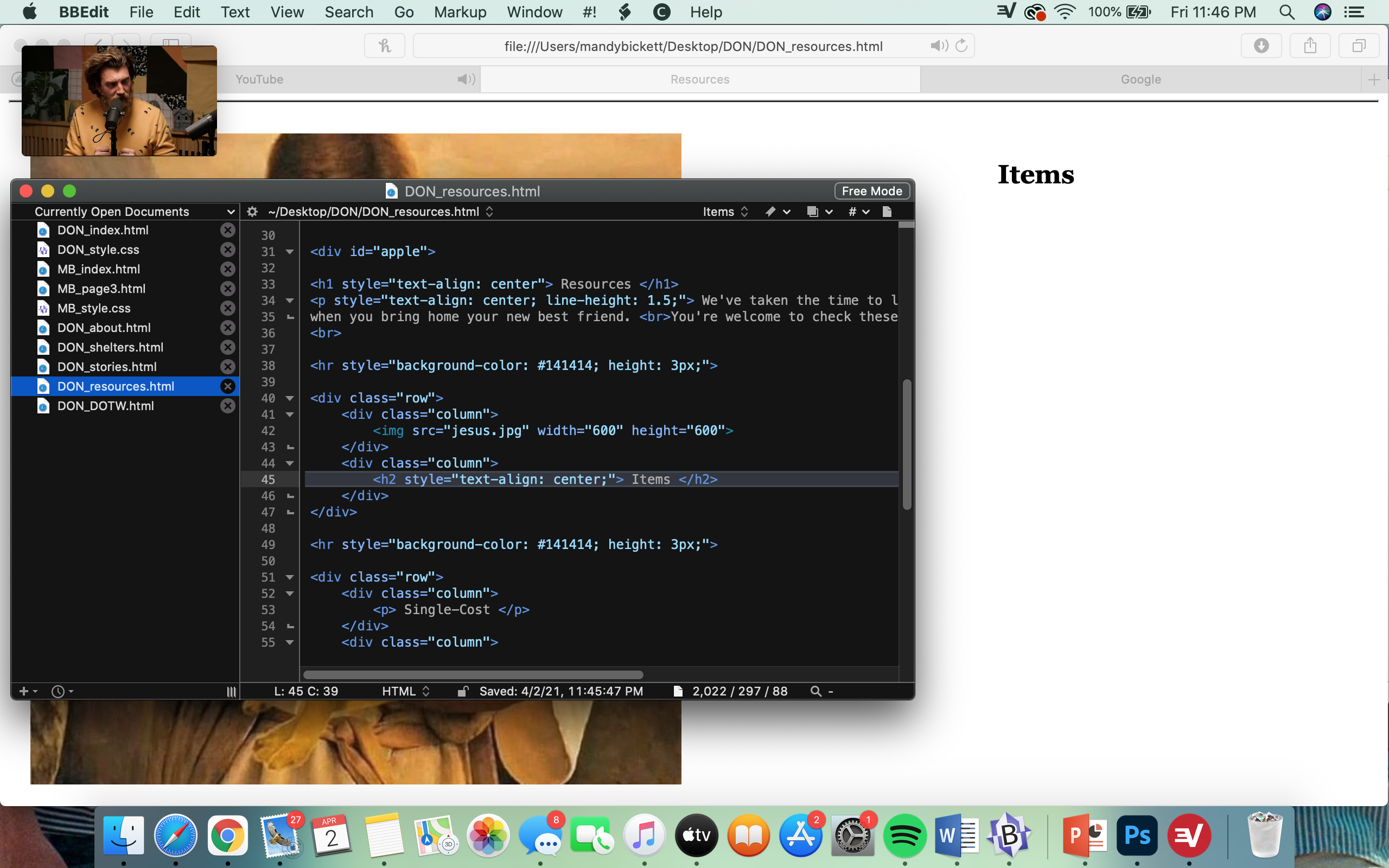
I was glad for the opportunity to work with my group during class time in order to get input on how to revise certain aspects of the site. It was incredibly useful to have fresh eyes in design, but also to ensure that I wasn't missing any information. There were times when I would present an unfinished product of the website to my group and ask for recommendations, and they would ask about a certain paragraph alignment or possible addition to a page, especially the "Resources" page. Often, revision consisted of small things, such as italicizing a certain line of text, linking an image to an external site, proofreading (and re-proofreading) for citations and potential plagiarism, or resizing an image to fit it's parallel text. Revision was the part of the process that not only ensured that I had included most of the information that we had agreed on, but also the part that made sure the design of the site was put together in a useable, but visually pleasing way. It took a few days of presenting a draft to the group, receiving feedback, looking at the site with my own fresh eyes, and making small adjustments on a day-by-day basis to complete a decent revision process.
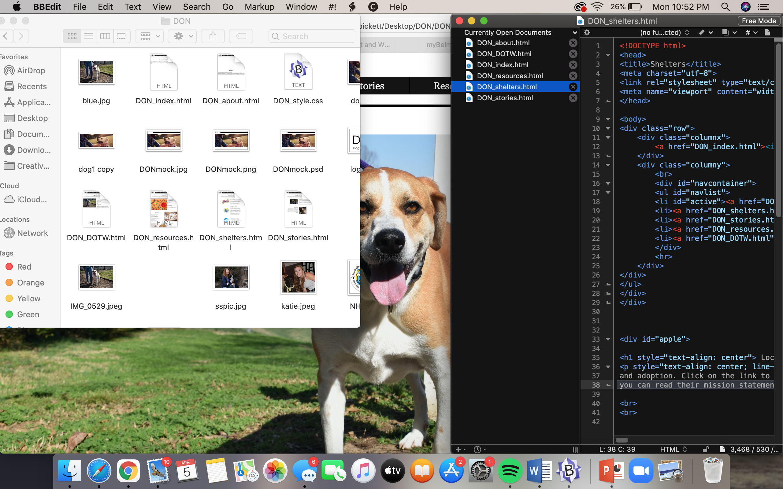
When our group presented the website for usability testing, there were a few unexpected errors that I had overlooked. My first mistake was forgetting that the file needs to simply be titled "index.html" -- not "DON_index.html" or any other derivations. It made the first step of usability -- simply accessing the website -- impossible. I revised that part as soon as I understood what had gone wrong. The other issue we encountered in our testing day was the layout of our website changing depending on the width of the screen on which it was tested. When the screen shrank from the standard width (or, the width of my computer, which I used to build the site), it messed up the navigation bar and "Resources" page, especially the images. A wider screen likewise distorted the design, but only marginally, and not as drastically. Similarly, it was nearly impossible to access the website via mobile device. I can't be entirely sure that I've fixed some of these errors, such as mobile access, because I no longer have access to different devices and outlets. However, I did the research needed to try to mend these usability errors, and I believe I've fixed the trouble we had with image and text on the "Resources" page. These were entirely unexpected errors, so I'm glad I had the opportunity to test them and try to fix them before turning in the final product. They were moderate errors, but simple solutions.
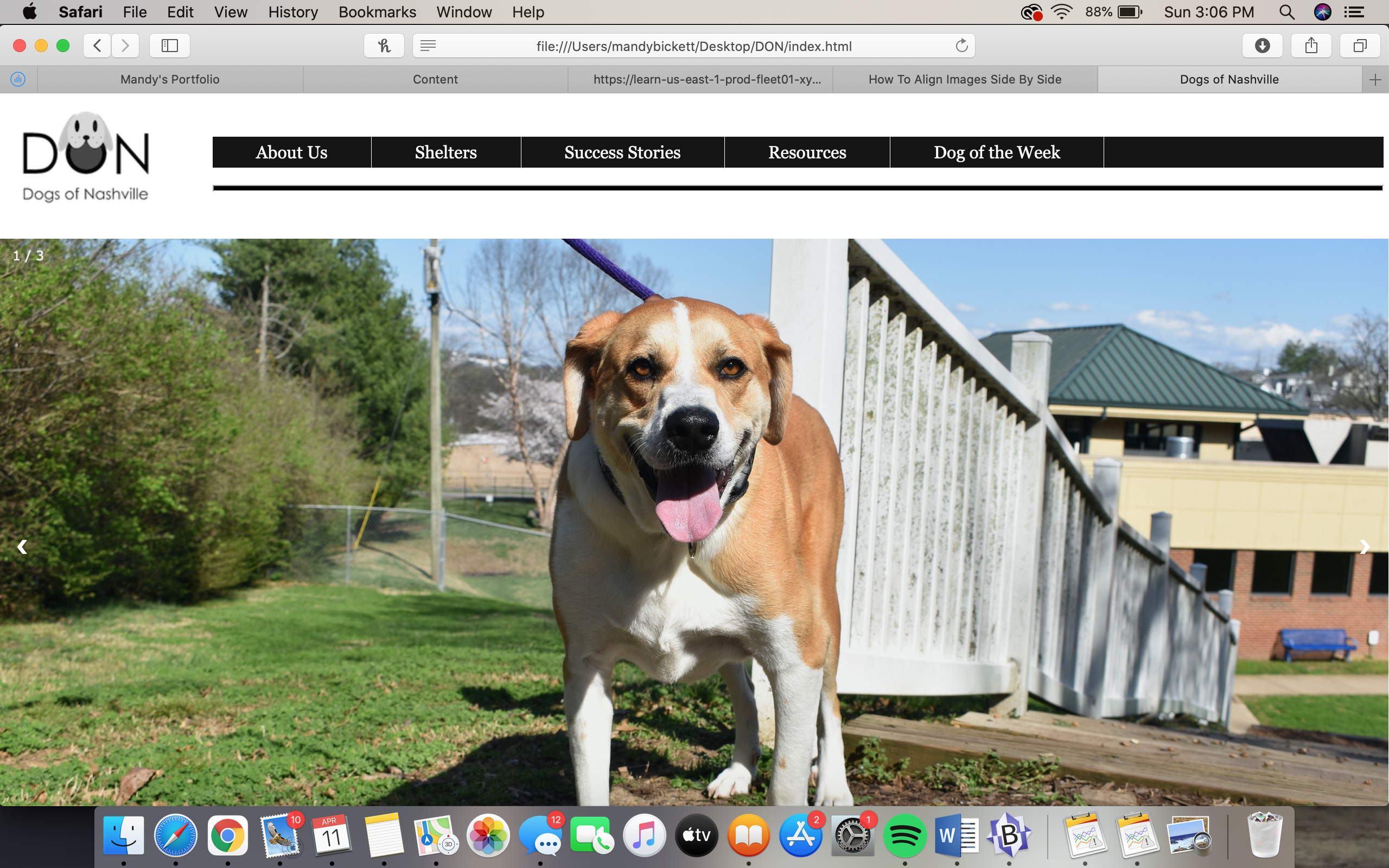
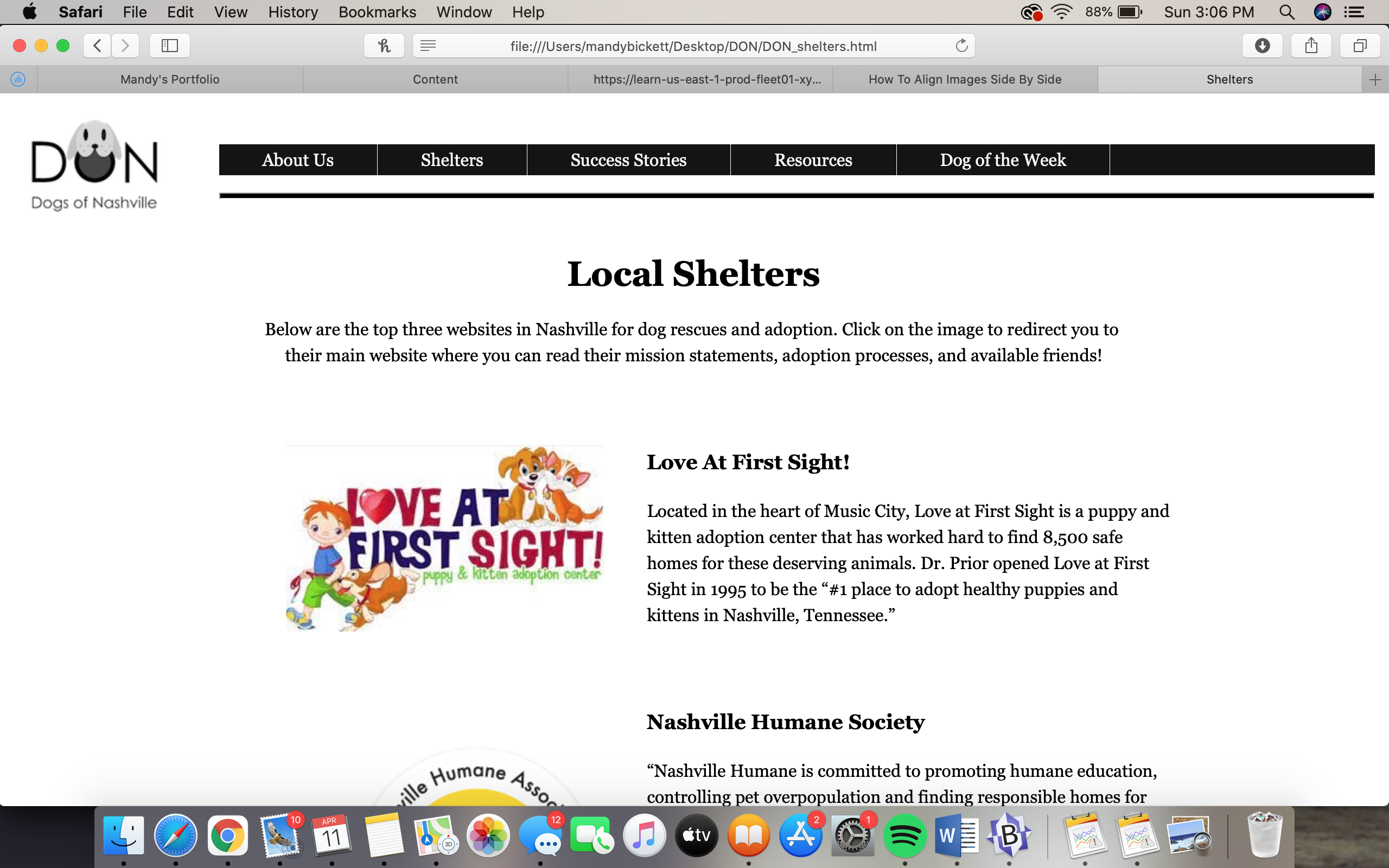
The final site design employs a mixture of the design principles we've learned over the course of the semester. For contrast, I tried to focus on the color spectrum. The layout of the site is black and white (naturally opposing colors), but that binary itself contrasts with the color that we use in our images. It keeps the site useable, but the attention focused on the content, not necessarily the organization as a brand. Our repetition is found in pages such as "Shelters" and "Success Stories," where there are multiple rows and columns used to display the information on the page. The "Shelters" page is particularly repetitive, as all the images and text are in the same placement on each row, but the "Resources" page is repetitive in a contrasting way, where the text and images switch places with each row. I tried to make sure that, in terms of proximity, all text and images were close together to make sure the information was fluid and easy to read, especially on the "Shelters" page. Finally, my favorite principle, alignment, was the element I focused on the most in the design of this site. The horizontal logo and nav bar at the top constantly contrasts the body of the pages, which run vertically centered in their own way. The space in the "Shelters" page is off-centered, but by making it off-centered, it centers the content of the page as a whole with the page title. The slideshow on the home screen runs parallel to the navigation bar at the top, but it allows the paragraph underneath to attract more attention. I took great care to make sure the text boxes either aligned neatly with the edge of an image, or a text box standing alone was justified. The primary aspect of the page's alignment is very linear, whether those are parallel or purposefully perpendicular, in a way that I tried to make visually appealing and useable all at once.
The end result of this project is the website for DON, which I couldn't have made without my teammates. I'm grateful for the opportunity to be the group coder, because I know this project has made me incredibly confident in my coding abilities, and I will very likely continue to learn about coding after the completion of the class. I'm incredibly proud of the final result of the website, and I hope that I've served my teammates well in this group project.