Coding:
Splash page:
First of all, before we started on our personal pages and the template page, we needed to make a splash page. After discussing the layout and design for the splash page, we decided to make the splash page have clickable images to lead into each site. To create this vision, I needed to offset the part of the page that would scroll and so I created rows (grid-x) and a box each image needed to go in (cells). But before I started on the images, the header logo needed to be set on top of that with a sticky header so that part would not scroll but stay still in the process. As for the layout of the splash page I offset the logo to the right 7 cells and put it into a size 5 cell. I then thought about the usability and responsiveness of the webpage, so I added a medium size screen and small size screen to promote and target an audience that mainly had tablets, phones, and medium-sized laptops; the material would respond by shrinking or expanding to fit the screen of the user, so it becomes a user-friendly website. The layout also makes the website easily navigable due to the menu and pictures of what is going to be included in the individual webpages, which makes it a clear representation to the public. For the images themselves, I inserted a rollover image so that when a mouse hovers over an image the picture would be highlighted and switched to the regular and clear image. With putting in the images and their rollovers, making the background stay in place, putting the sticky logo at the top, dividing the cells/rows, and making the website responsive, I ended up with the result of a fully coded and pleasing representation of the original ideas given to me to put into place.
Template Page:
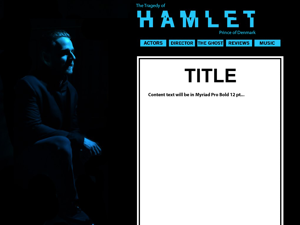
In addition to making the splash page, I ended up coding the template page too. Because each webpage needed to be similar in design and material was to be put into the scroll box, the template page was created as a way to have the site done but only have to put in materials that were collected by each individual group. I used the layout of rows and cells from the splash page and instead put the white scroll box in its place. It had all the same features such as the sticky header and the same layout, but it was open to be edited when needed by each group.
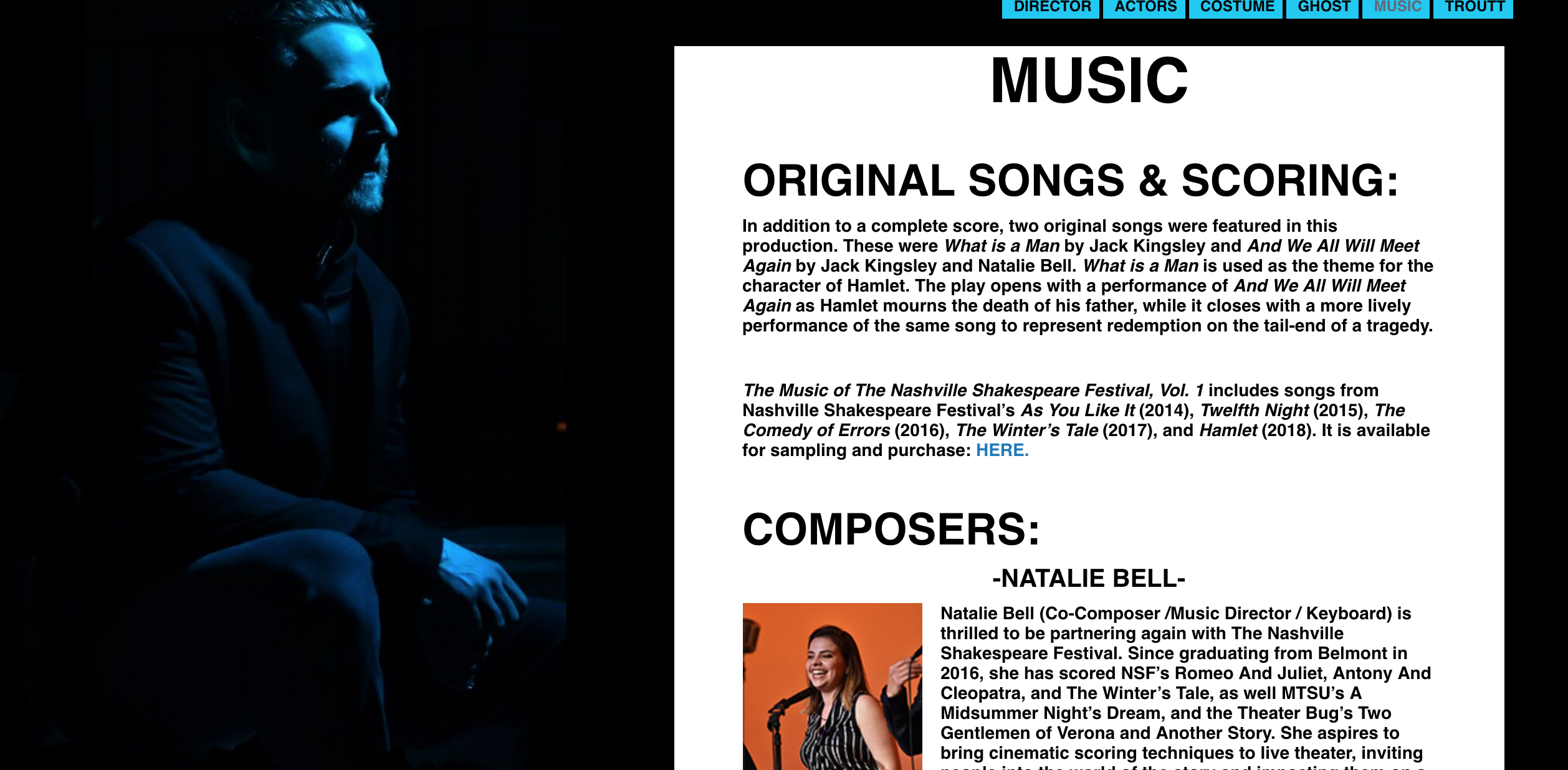
Music (personal group) page:
For our smaller group work, I was mainly in charge of compiling the materials such as videos, audio files given to us by Natalie and Jack, Spotify playlists, biographies, and images acquired from the music artists. After we had all of the materials and content, it was my job to arrange them in a layout that made sense to our group and then code them/make our page responsive to smaller and larger devices. As far as layout, organization, and proximity goes, I wanted the two composers to be towards the top of the page after the introductions because it was important to have them highlighted as the feature of our page. For my final piece of organization, I wanted the video interviews to follow the biographies because it seemed to take precedence over the playlist and the music clips.
Project Manager:
As an extra role to my group and the representative coding group, I volunteered to be the project manager. In my role, I answered any questions other students had about site responsiveness, how to apply a certain tag, layouts, and embedding videos and other files. I also was in charge of compiling and working with CSS to make sure it was compatible with everyone’s individual pages. I went through some student’s coding because they had very specific issues and finally we solved them by finding unnecessary tags or applying inline styles specific to their page. Finally, I worked with Dr. Overall for class adjustments in CSS or HTML that applied to each page such as the border, cell/box size, and font styles.
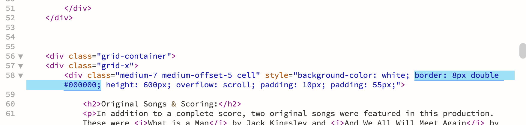
Border Research:
When the template was done, the only thing left to match the original design was the black border that was just inside the white background of the scrolling box. Since the background and border were black, I had discovered that there was a way to put a double border around the white background but still have it match the original design because the first border would be invisible. For proximity I chose an 8px size to match the layout and design of the original work and did an inline style of a “border: double 8px black.” It ended up working and matching the design perfectly.
Video:
Questions:
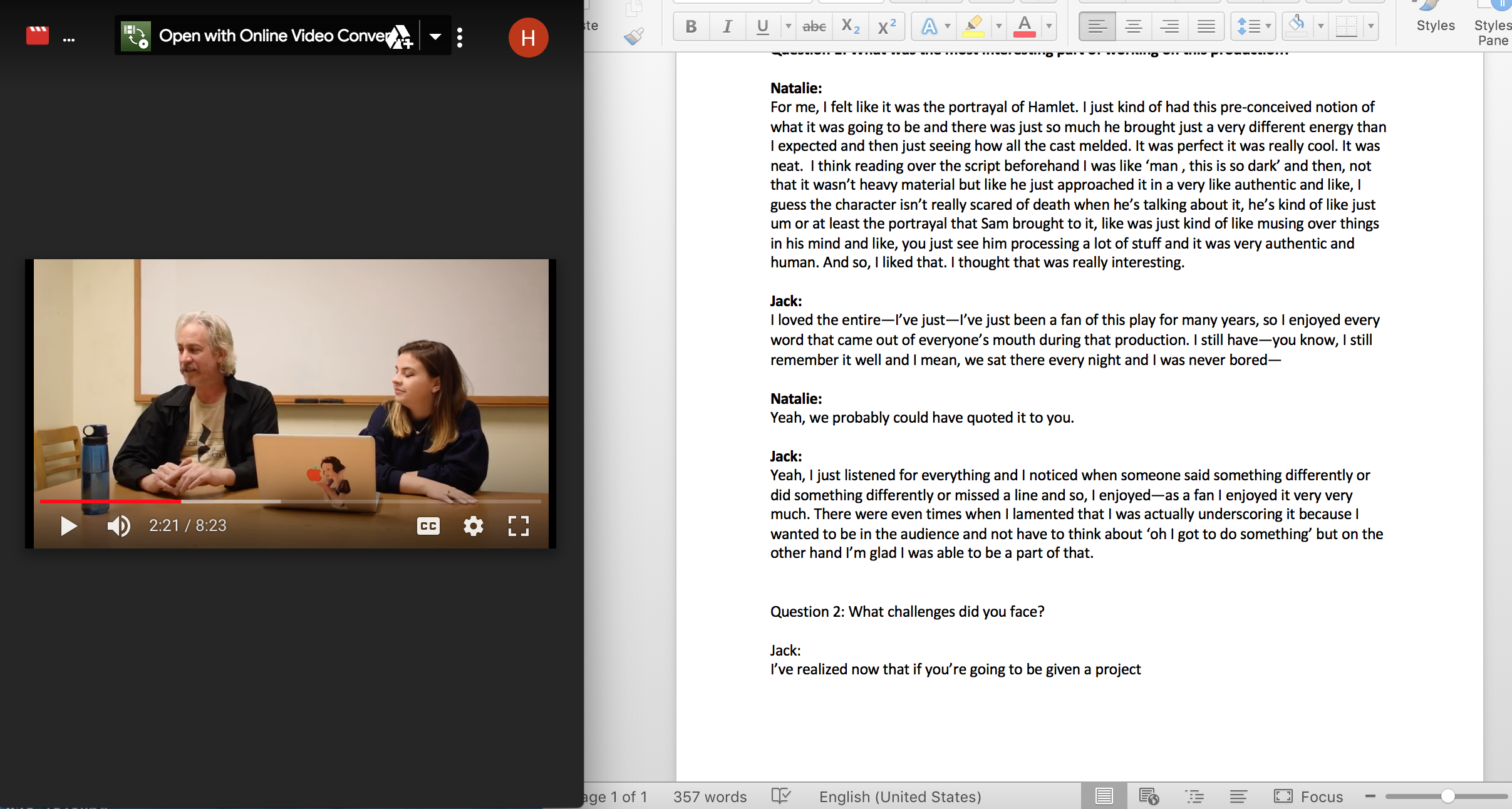
To assist in video production and the interview process for our group since I couldn’t physically be at the interview due to a conflicting class, I wanted to make sure I helped compile additional questions to Aubrey’s original set. I helped to elaborate and think of additional questions that I thought would be helpful to our page and contribute to the Nashville Shakespeare Festival audience.
Transcribing:
To make sure our site was reaching every type of audience member we could think of, our group decided it was necessary to transcribe the video for people with a potential disability of hearing. Part of my job was to transcribe part two of two videos. I began with the eight-and-a-half-minute video and then finished it in four and a half to five hours. It was very difficult in some areas of the video because at times, Jack and Natalie would talk over each other or jump in when another was talking, so it was hard to hear specifically what they were saying.
Flyer:
Design:
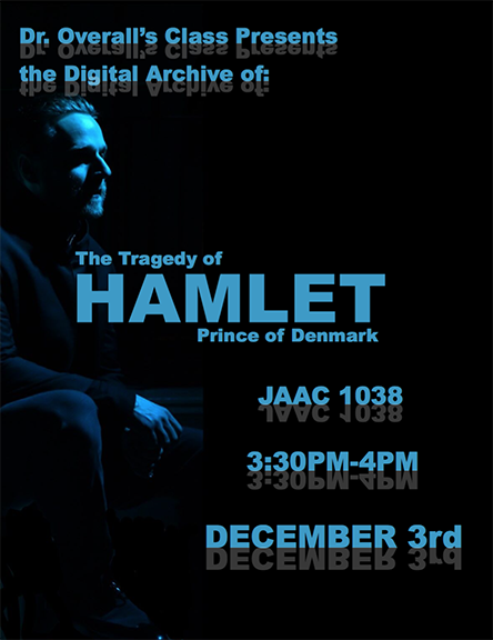
The last element I chose to do was to design the invitation flyer that was sent out to the people of the Nashville Shakespeare Festival and the classes who had previously taken Digital Literacies. I wanted to keep the design simple and to match the website color scheme/design as much as possible without giving out all of the information to our audience. To keep it simple, I decided to match the contrast of the website which was the simple color-scheme of black, white and blue. After I decided what the colors were going to be I thought about how to convey the concept of Hamlet with the simplicity of typography. I replicated the typeface of the website and chose to do a reflection of white with low opacity underneath it. The flyer had a picture of Hamlet looking off into the distance just like it is on the webpages and he seems like he is reflecting on himself and the past, so I wanted the design—especially the text— to match that feeling.